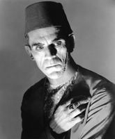
Good Grief, Charlie Schwab
Is anyone else intensely annoyed by the creepy animation of the latest Charles Schwab ad campaign?
No doubt you've seen the commercials, which utilize the "interpolated rotoscoping" technique employed in Richard Linklater 's cool-if-you've-gorged-yourself-on-laced-brownies film, Waking Life. In the Schwab TV spots, animated folks, just like you and me, gripe about the disinterest, insolence and generally piss-poor advice of their non-Chuckie brokers.

What exactly is the purpose of animating these spots?
Slate's Seth Stevenson notes that Schwab wanted to stand out from the dull din of finance-related commercials.
" ... When the novelty of the animation wears off it's the tone of these Schwab spots that we're left with. These ads are about dissatisfaction. The characters are all men who are sick of their own impotent anger. They hate their brokers' steep commissions and bland, unhelpful advice. They want straight talk and lower fees. 'It would be nice if the quarterly report had some kind of analysis,' says the annoyed fellow in a spot titled 'Dog,' which addresses investors' uncertainty over when to unload an underperforming stock.
"These fed-up, frustrated guys are exactly the type of investor Schwab wants to target with this campaign. They're the customers most likely to be lured away from Schwab's competitors. While most folks stick with a broker for decade after decade (because switching is a pain in the neck and seldom seems worth the effort), these spiteful dudes are prone to switch brokers out of restlessness, or rage."
Speaking as a dude sick with anger (notice I didn't say impotent anger) who stayed with an awful broker for years out of sheer laziness, I can appreciate the content of Schwab's ad campaign.
But I am not so forgiving of the animation, which strikes me as nothing more than show-off distractions. I don't understand the rationale of animated talking heads.
By that logic, I suppose it's just a matter of time until we see Glengarry Glen Ross: The Cartoon.

"Always ... be ... closing!!!"


6 Comments:
Creepy, indeed. And obviously too distracting. I remember well the characters of those commercials, but until you posted this, I had no idea what the commercial was about or who it was for.
Scary. Like the BK King, but with financial issues.
Chase, I think you need to start posting mini-podcasts from with the keynote opener,
"D'ya ever notice?" and then you can tell us about your pet peeves with road signs and other Rooneyesque observations. I, too, find the ads annoying - especially the one with the woman sitting on a ski lift and plastering Chapstick on her lips as she talks about her investment advisor....
Yes, and maxi-podcasts with Mickey Rooneyesque observations like, "You ever notice that when you're walking under Ann Miller's dress, you get hit in the face with a tanger?"
This animation style is totally headache-inducing and has the word 'gimmick' written all over it. I'm very disappointed Linklater is using it again for his next feature. Watching the extras on the Waking Life DVD, seeing some scenes without the animation laid over, you can tell what a thin film it really is, not to metion a complete retread. It's Slacker without a sense of humor.
My wife and I are completely freaked out by these scary commercials. While we hate them and they will make me steer clear from Schwab, they have got people talking, so maybe they are not too bad of an idea...
I just saw another of these commercials and went directly to Google and looked up "creepy Charles Schwab." That's how I found your blog. I just knew I wasn't the only one put off by their ads. And I may remember their name now that I've done a Google search, but I would never buy from them. I would think, "Oh, Charles Schwab? No way! They're the ones who put out those creepy commercials."
Post a Comment
<< Home